第12章:デザイン
SassとBEMを組み合わせる
CSS用クラス名の命名規則例
事前に以下のような命名規則を定めておくと作業時に迷うことがなくなる。
・CSS用にid属性は使わない
・class属性はBEMで命名する
・JavaScript用のid属性やclass属性は「js-名前」と接頭辞「js-」をつける
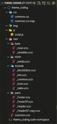
フォルダ構成例
SassとBEMを組み合わせる際はブロック(パーツ)ごとにSCSSファイルを分けて管理すると扱いが楽。
ワークスペースの設定
ワークスペースファイルにSassの設定等を追記する。
※コレをコピペして使うといい★
{
  "folders": [
    {
      "path": "."
    }
  ],
  "settings": {
  // Sassのコンパイルによる出力設定
  "liveSassCompile.settings.formats": [
    {
      "format": "expanded",
      // "expanded", "compact", "nested", "compressed",
      "extensionName": ".css",
      "savePath": "/css/"
      // null, "/", "~/../",
    }
  ],
}
}
baseフォルダ:ResetCSSと変数定義ファイル
baseフォルダにはデザイン前の準備ファイルを配置する。主にResetCSSや変数定義ファイルを作成する。
ResetCSS
授業で使用したリセットCSS ←「_reset.scss」にコピペする
変数定義
CSSファイル内で共通で使う値を変数として定義する。今回はゴシック体と明朝体の基本書体を変数に定義する。
GoogleFontsの「Noto Sans JP」「Noto Selif JP」を読み込んだ場合は優先して表示する。
必要であれば基本カラーや指し色等を変数で定義する。
// 基本カラーや指し色等を変数で定義する

// サイト内でよく使う色
$color: #6e3a3a;
$color-main: #009688;
$color-sub: #917347;
$color-accent: #ba2636;

$sansSerif:  // ゴシック系フォント
  "Noto Sans JP", "Helvetica Neue", Arial, "Hiragino Kaku Gothic ProN", Meiryo,
  sans-serif;
$serif:  // 明朝系フォント
  "Noto Serif JP", "Times New Roman", "YuMincho", "Hiragino Mincho ProN",
  "Yu Mincho", "MS PMincho", serif;
mixinフォルダ:Sass内でよく使う記述を定義
mixinフォルダにはSass内でよく使うデザイン定義や記述を定義する。
今回はメディアクエリを定義する。
メディアクエリの定義
// ブレイクポイント
// Sassの変数  ※配列もある
$breakpointPC: 600px;
$breakpointSP: 599px;

@mixin pc {
  @media only screen and (min-width: $breakpointPC) {
    @content;
    // 呼び出し時のブロック内容を
    // @content部分に反映させる
  }
}

@mixin sp {
  @media only screen and (max-width: ($breakpointSP)) {
    @content;
  }
}
moduleフォルダ:パーツを超えて利用するデザイン
BEMのブロックを超えて利用するデザインを定義する。
主に共通デザインやボタンデザイン、フォームデザイン等を作成する。
共通デザイン
/*---------------------------------
ページ全体の共通デザイン
※ここは最初に決めたら基本的に変更しない
変更時は制作チーム全体でファイルを更新する
---------------------------------*/
body {
  background-color: #fefefe;
  color: #6e3a3a;
  font-family: $sansSerif;
  overflow-wrap: break-word; //改行
  letter-spacing: 0.1em;
  @include pc {
    font-size: 16px;
  }
  @include sp {
    font-size: 4vw;
  }
}
// 見出し
h1,
h2,
h3,
h4,
h5,
h6 {
  clear: both;
  text-align: justify;
}
// 文章
p {
  text-align: justify;
}
code {
  @include pc {
    font-size: 13px;
  }
  @include sp {
    font-size: 3.5vw;
  }
}
pre {
  @include pc {
    font-size: 13px;
  }
  @include sp {
    font-size: 3.5vw;
  }
}

// 画像
img {
  max-width: 100%;
  height: auto;
  vertical-align: bottom;
}
figcaption {
  color: #666;
  font-size: 80%;
  padding: 0.5em 0;
}
// リンク
a {
  color: #0693e3;
  text-decoration: none;
}
a img {
  transition: opacity 0.5s;
}
a:hover img {
  opacity: 0.7;
}
a[href^="tel:"] {
  color: #0693e3;
}
@include pc {
  a[href^="tel:"] {
    pointer-events: none; //電話がかからないようにする定義
  }
}
// テーブル
table {
  border: solid 1px #009688;
  margin: 1em 0;
  font-size: 90%;
}
th {
  border: solid 1px #009688;
  background-color: #d3dada;
  color: #009688;
  padding: 0.5em;
  white-space: nowrap;
}
td {
  border: solid 1px #009688;
  background-color: #fff;
  color: #009688;
  padding: 0.5em;
}

/*---------------------------------
よく使うスタイル
---------------------------------*/
/* 表示領域 */
@include pc {
  body {
    min-width: 960px;
  }
  .inner {
    width: 960px;
    margin: 0 auto;
  }
}
/* 文章の回り込み */
@include pc {
  .alignleft {
    float: left;
    margin-right: 1em;
  }
  .alignright {
    float: right;
    margin-left: 1em;
  }
  .aligncenter {
    text-align: center;
  }
}
@include sp {
  .alignleft,
  .alignright,
  .aligncenter {
    text-align: center;
  }
}
/*---------------------------------
PC/ スマホ別表示
---------------------------------*/
@include pc {
  .sp {
    display: none;
  }
}
@include sp {
  .pc {
    display: none;
  }
}
ボタンデザイン
.btn01 {
  display: inline-block;
  background-color: #eee;
  color: #333;
  padding: 1em 4em;
  font-size: 1.1em;
  transition: background-color 0.5s;
}
.btn01:hover {
  background-color: #e6f6ff;
  text-decoration: none;
}
フォームデザイン
label {
  vertical-align: middle;
}
input[type="text"],
input[type="password"],
input[type="email"],
input[type="tel"] {
  background-color: #fff;
  color: #333;
  padding: 0.5em;
  border: solid 1px #ccc;
  max-width: 100%;
}
input[type="button"],
input[type="reset"],
input[type="submit"] {
  background-color: #fff;
  color: #333;
  padding: 0.5em;
  border: solid 1px #ccc;
  max-width: 100%;
  &:hover {
    background-color: #ccc;
  }
}
textarea {
  background-color: #fff;
  color: #333;
  padding: 0.5em;
  border: solid 1px #ccc;
  width: 100%;
}
.require {
  font-size: 80%;
  color: #ffc107;
}
書き出し用CSS
パーシャルファイルを読み込んで書き出す本体SCSSファイルを作成する。
今回は「common.scss」を作成する。
SCSSを増やした際にはココに書き足していく。
※共通デザインの「_common.scss」とは別ファイルなので注意する。
/* --------------------------------
* WebFonts
* -------------------------------- */
@import url("https://fonts.googleapis.com/css2?family=Noto+Serif+JP:wght@200;400;700&display=swap");
/* --------------------------------
* ベース
* -------------------------------- */
@import "base/variables"; //変数は最上部で読み込む!!
@import "base/reset"; // ResetCSSの読み込み
/* --------------------------------
* ミックスイン(サイト共通スタイル)
* -------------------------------- */
@import "mixin/media"; // mixin定義も呼び出し前で読み込む
/* --------------------------------
* モジュール(サイト共通スタイル:優先度・低)
* -------------------------------- */
// 基本
@import "module/common";
// モジュール
// モジュールSassは数が多くなるのでアルファベット順に読み込むとわかりやすい
@import "module/blockEditor";
@import "module/btn";
@import "module/form";
@import "module/table";
/* --------------------------------
* パーツ(ブロックスタイル:優先度・高)
* パーツSassは数が多くなるのでアルファベット順に読み込むとわかりやすい
* -------------------------------- */
@import "parts/Footer";
@import "parts/FooterSP";
@import "parts/Header";
@import "parts/HeaderSP";
BEMブロック(パーツのデザイン定義)
ファイル名
_BEMブロック名.scssファイル名は「_BEMブロック名.scss」で命名する。
例)「_Header.scss」「_Footer.scss」「_Box.scss」
記述の基本ルール例
- 基本的に子孫セレクタを使用しない
※セレクタのポイント計算を簡略化するため - 「Block」と「Blocs_element」に対するセレクタは「&」を使わずに記述する
※「&_element」と書く方法もあるがセレクタ検索しやすくするため - 「-modifier」は「&」を使って記述
- 「:hover」などの疑似クラスも「&」を使って記述
- 「::before」や「::after」などの疑似要素も「&」を使って記述
- メディアクエリは「mixin」を使用する
- 必要であれば変数を使用する
ブロック名:Boxデザイン
.Box {
  line-height: 1.6;
}
// ヘッダー
.Box_header {
  text-align: center;
  padding: 80px 0;
  clear: both;
}
.Box_mainTitleJp {
  font-size: 180%;
  letter-spacing: 0.3em;
  text-align: center;
  padding-left: 0.5em;
}
.Box_mainTitleEn {
  font-size: 80%;
  letter-spacing: 0.2em;
  padding-left: 0.2em;
  margin-top: 1.5em;
}
// アイキャッチ
.Box_eyecatch {
  margin-bottom: 40px;
}
@include pc {
  // カードリスト
  .Box_cardList {
    display: flex;
    flex-wrap: wrap;
  }
  .Box_cardList::before {
    content: "";
    display: block;
    width: 300px;
    height: 0;
    order: 1;
  }
  .Box_cardList::after {
    content: "";
    display: block;
    width: 300px;
    height: 0;
  }
}
// 先頭固定表示
.Box_sticky {
  padding: 15px;
  margin: 0 -15px 10px;
  background-color: #fdeef3;
}
.Box_stickyTitle {
  text-align: center;
}
// 本文表示
.Box_title {
  text-align: center;
  @include pc {
    font-size: 2em;
  }
  @include sp {
    font-size: 1.3em;
  }
}
.Box_content {
  @include pc {
    width: 700px;
    margin: 0 auto 30px;
  }
  @include sp {
    margin: 0 5vw 30px;
  }
}
// タクソノミー
.Box_taxonomies {
  padding: 10px;
  font-size: 80%;
}
// フッター
.Box_footer {
  clear: both;
  text-align: center;
  padding: 40px 0;
}
ブロック名:Cardデザイン
.Card {
  @include pc {
    display: flex;
    width: 300px;
    margin-right: auto;
    margin-top: 20px;
  }
  @include sp {
    text-align: center;
  }
  &:nth-child(3n) {
    @include pc {
      margin-right: 0;
    }
  }
}
.Card_link {
  display: block;
  padding-bottom: 20px;
  @include pc {
    border-bottom: solid 1px;
  }
  .Card_img {
    transition: transform 1s;
  }
  &:hover {
    .Card_img {
      @include pc {
        opacity: 1;
        transform: scale(1.1);
      }
    }
  }
}
.Card_figure {
  height: 200px;
  overflow: hidden;
  @include pc {
    width: 300px;
  }
  @include sp {
    width: 90vw;
    margin: 0 auto;
  }
}
.Card_img {
  height: 200px;
  object-fit: cover;
  @include pc {
    width: 300px;
  }
  @include sp {
    width: 90vw;
  }
}
.Card_title {
  line-height: 1.4;
  text-align: center;
  @include pc {
    font-size: 80%;
    padding: 15px 0 0;
  }
  @include sp {
    padding: 15px 3vw 0;
  }
}
.Card_excerpt {
  line-height: 1.4;
  color: #333;
  @include pc {
    font-size: 80%;
    padding: 15px 0 0;
  }
  @include sp {
    padding: 15px 3vw 0;
  }
}
ブロック名:Headerデザイン
.Header_top {
  font-size: 70%;
  padding: 0.5em 0;
  text-align: center;
}
.Header_logo {
  text-align: center;
  padding: 30px 0;
  img {
    width: 200px;
    height: auto;
  }
}
.Header_logoLink {
  display: block;
}
.Header_info {
  display: flex;
  justify-content: center;
  font-size: 80%;
}
.Header_item {
  margin: 0 1em;
}
.Header_icon::after {
  content: ":";
}
.Header_value {
  font-size: 140%;
}

.Header_container,
.Header_menu {
  & > ul {
    display: flex;
    flex-wrap: wrap;
    justify-content: center;
    margin: 50px 0 0;
    & > li {
      position: relative;
      text-align: center;
      padding: 1em 0;
      & > a {
        color: #333;
        padding: 0.3em 1em;
        position: relative;
        &::after {
          content: "";
          position: absolute;
          bottom: -10px;
          left: 50%;
          margin-left: -5px;
          display: block;
          width: 5px;
          height: 5px;
          border-top: 5px solid #333;
          border-right: 5px solid transparent;
          border-bottom: 5px solid transparent;
          border-left: 5px solid transparent;
          opacity: 0;
          transition: opacity 0.5s;
        }
        &:hover::after {
          content: "";
          opacity: 1;
        }
      }
    }
  }
  .children,
  .sub-menu {
    display: none;
    position: absolute;
    top: 50px;
    min-width: 100%;
    a {
      display: block;
      background-color: #eee;
      color: #333;
      padding: 10px;
      &:hover {
        background-color: #e6f6ff;
      }
    }
  }
  li:hover .children,
  li:hover .sub-menu {
    display: block;
  }
}
ブロック名:FooterNavデザイン
.FooterNav {
  background-color: #333;
  margin-top: 40px;
}
.FooterNav_container,
.FooterNav_menu {
  & > ul {
    display: flex;
    flex-wrap: wrap;
    justify-content: center;
    & > li {
      position: relative;
      text-align: center;
      padding: 1em 0;
      & > a {
        position: relative;
        color: #fff;
        font-size: 80%;
        padding: 0.3em 1em;
        &::after {
          content: "";
          position: absolute;
          bottom: -10px;
          left: 50%;
          margin-left: -5px;
          display: block;
          width: 5px;
          height: 5px;
          border-top: 5px solid #fff;
          border-right: 5px solid transparent;
          border-bottom: 5px solid transparent;
          border-left: 5px solid transparent;
          opacity: 0;
          transition: opacity 0.5s;
        }
        &:hover::after {
          content: "";
          opacity: 1;
        }
      }
    }
  }
}
ブロック名:Footerデザイン
.Footer {
  background-color: #222;
  color: #fff;
  margin-top: auto;
  padding: 20px 0;
  a {
    color: #fff;
    text-decoration: none;
    &:hover {
      text-decoration: underline;
    }
  }
  table {
    a {
      color: #0693e3;
    }
  }
}
.Footer_copy {
  font-size: 70%;
  text-align: center;
  margin-top: 20px;
}
ブロック名:Pagenationデザイン
$main-color: #e6f6ff;
.Pagination {
  padding: 40px 0 20px;
  a {
    transition: background-color 0.5s;
  }
  a:hover {
    background-color: $main-color;
    color: #333;
  }
  .page-numbers {
    display: block;
    padding: 8px 18px;
    color: #333;
    margin: 0 3px;
    border: solid 1px #ccc;
  }
  .current {
    background-color: $main-color;
    color: #333;
  }
  .dots {
    background-color: transparent;
    color: #333;
    box-shadow: none;
    border: none;
    @include sp {
      padding: 8px 0;
    }
  }
}
.Pagination_list {
  display: flex;
  justify-content: center;
}
.Pagination_listItem {
  display: flex;
  justify-content: center;
}
.Pagination_total {
  text-align: center;
  padding: 10px;
  @include sp {
    color: $main-color;
  }
}